Shopify Header Customization Without Code: Why a LEGO-Like Layout Matters for RTL Stores
Most merchants never think about the header until it hurts.
Navigation wraps into two ugly rows. The logo fights the menu on Arabic. You add one more link and the whole bar breaks on a phone.
That pain is usually architectural. Not marketing. Not photography.
It happens on English storefronts too. A wide catalog, a promo banner, one extra utility icon—and the header starts fighting itself.
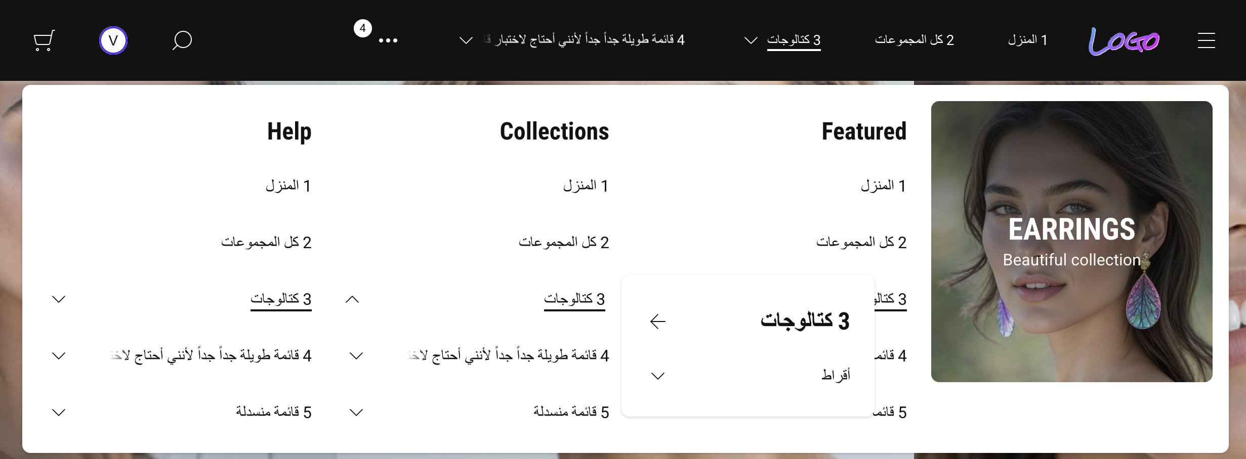
One strip. Too many jobs for one Shopify header.
A typical premium theme gives you one horizontal strip and a long settings panel.
You tweak padding. You toggle icons. You hope the mega-menu matches your brand.
But the layout is fixed. Left slot. Center slot. Right slot—often named “left” and “right” in plain English.
Online Store 2.0 opened the door to block-based headers — but most themes still ship a single frozen strip with a long settings panel and call it "flexible."
That works until you sell in Dubai, Tel Aviv, or any RTL storefront.
Then “left” and “right” stop being cosmetic labels. They become layout bugs.
Why “we’ll fix RTL later” fails
RTL is not a translation task.
It is a reading direction change. Icons, dropdown alignment, overflow behavior, and sticky bars all need to agree with that direction.
Themes that bolt RTL on top of LTR naming usually ship one of these outcomes:
- mirrored layouts that feel “almost right” to native readers
- dropdowns opening into dead space
- utility icons drifting away from where shoppers expect them
Merchants expanding into Saudi Arabia, UAE, or Israel run into this on day one. But even stores that never go RTL feel the same underlying problem: a header that was designed for one language, one catalog size, one screen width.
I’m building weTheON so RTL isn’t an afterthought.
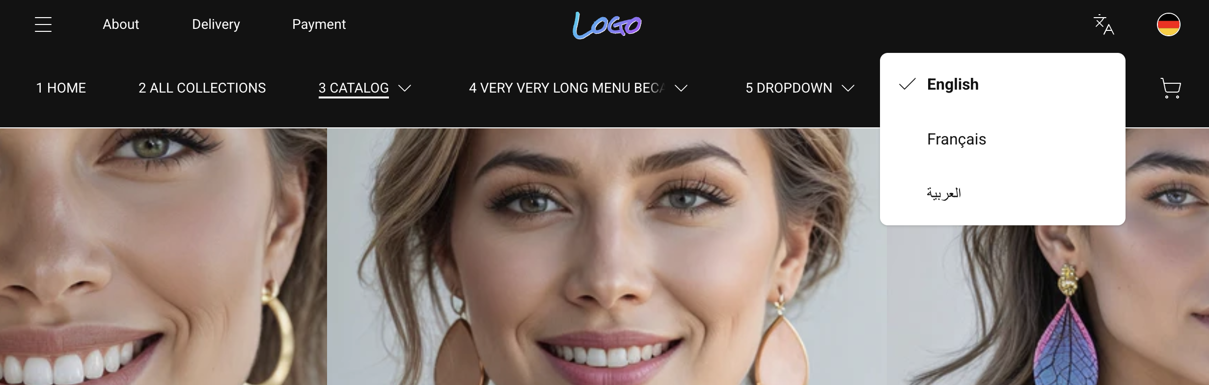
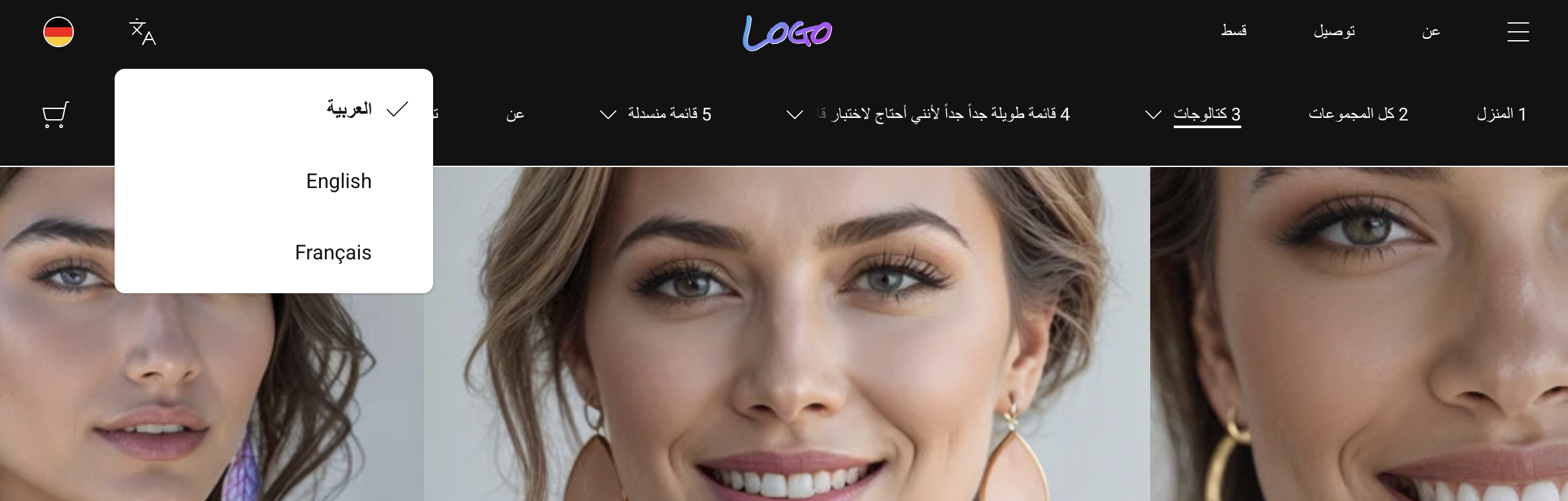
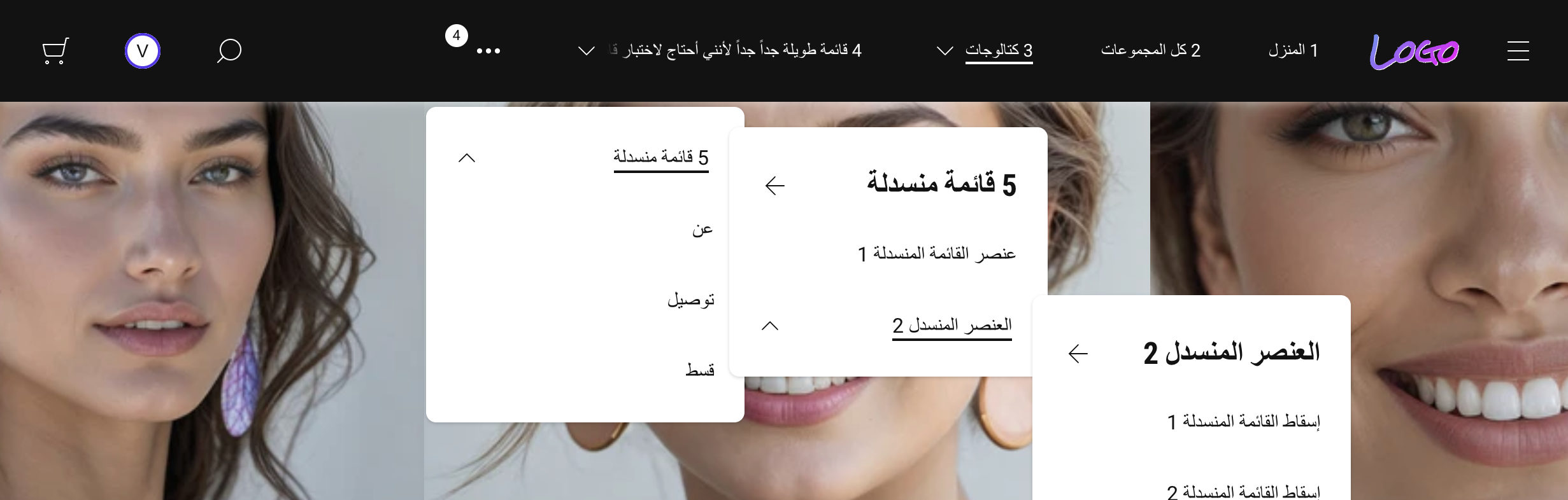
You’ll hear me say start, center, end instead of left and right in the editor—not because it sounds fancy, but because those names track how modern CSS handles direction.
Same blocks. Same merchant workflow.
Clean flip when the storefront language is Arabic, Hebrew, or Farsi.
Here's the same two-row header in both directions. No code changes between them.
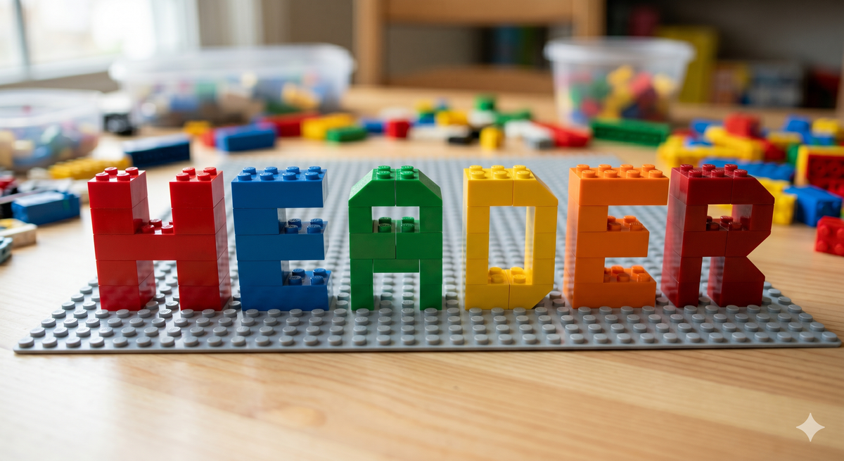
LEGO, not sculpture
Here’s the idea I optimize for.
Think LEGO bricks, not marble statue.
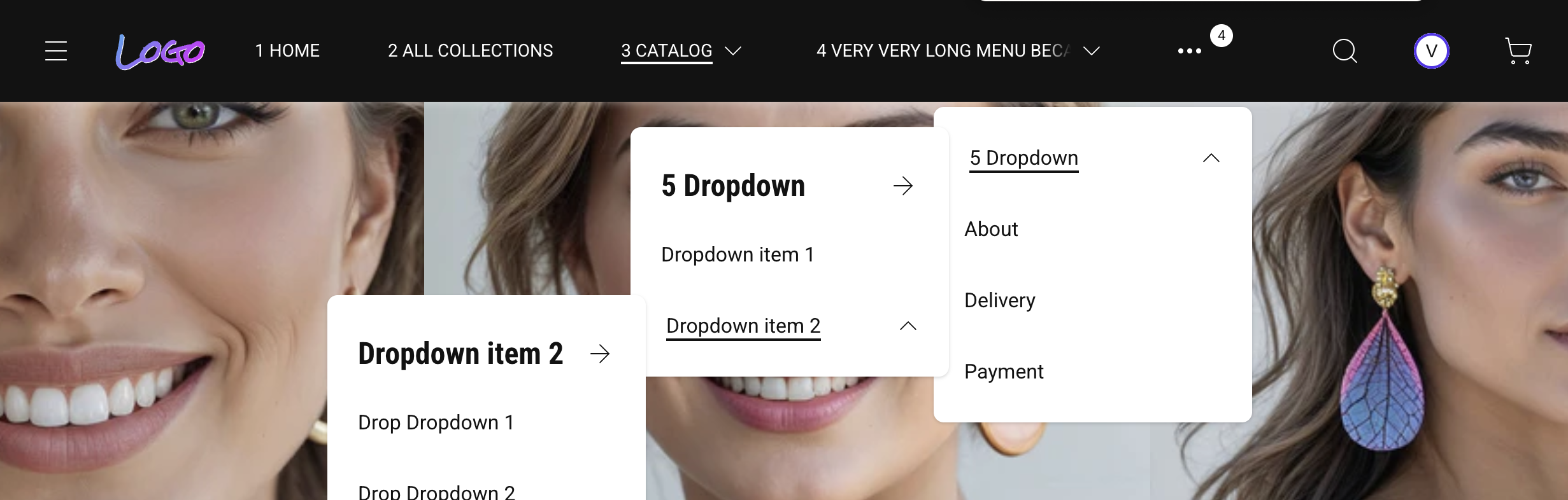
You drag blocks in the Theme Editor: logo, menu, promo mega-menu, drawer trigger, search, cart, language, currency.
You place them along three rails—leading edge, middle, trailing edge—without naming physical sides.
That matters for two reasons:
- Global expansion. EU label on the left today might need to feel natural on the opposite edge tomorrow.
- Conversion. Search and cart stay predictable. Menus don’t collide with trust badges or seasonal banners.
I’m not promising infinite layouts—good themes still enforce sanity—but the goal is composition without opening the code editor.
That is what Online Store 2.0 made possible — and what most themes still don't deliver.
The language switcher is one of the smallest blocks — and one of the most revealing. In RTL it opens toward the leading edge. In LTR it opens toward the trailing edge. Same block, same slot, zero extra configuration.
Overflow is a feature, not an embarrassment
Wide catalogs push every horizontal menu to its limit.
This is not an RTL problem. Every growing LTR store hits it the moment collections outgrow the original navigation plan.
Either items wrap into a mess. Or they disappear off-screen.
The approach I ship treats overflow as normal.
Extra top-level links tuck into a single “More” bucket so the bar stays one calm line on desktop.

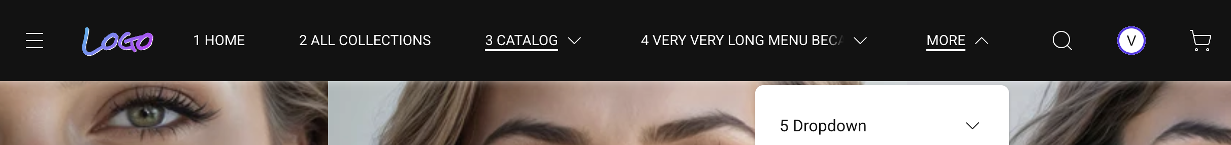
(No checkbox fantasy—“sometimes off”—that only produces broken screenshots in narrow viewports.)
Merchants keep full collections in Shopify navigation.
Customers keep scannability.
If this matches how you think about navigation, follow along — I publish exactly this kind of breakdown as the theme takes shape.
When one link name is longer than the slot
Real catalogs ship real words.
German compounds. Arabic phrases that do not abbreviate politely. A jewelry line named after three founders and a city.
Most themes pick a loser:
- the header row jumps to two lines
- or the label gets chopped mid-word with an ellipsis
- or the item silently steals width from its neighbors
None of that reads “premium.”
The behavior I’m aiming for is simpler for shoppers.
The label stays on one visual line so rhythm and spacing stay intact.
If the text still does not fit, it behaves like a restrained ticker: on hover—or keyboard focus for accessibility—the copy scrolls horizontally so you can read the full name without leaving the bar.
No shouting animation.
Just enough motion to finish the sentence.
In RTL storefronts the same idea mirrors naturally with reading direction, so the interaction still feels local—not “English logic pasted backwards.”
Horizontal peek-on-interaction is an old storefront trick; bookstores and transit boards used it before Shopify existed.
Mega-menus that carry merchandising
Jewelry, beauty, fashion—those verticals live or die on story.
Collections aren’t enough.
You need room for editorial imagery, highlighted edits, seasonal drops.
A theme header should let you pair structured links with promotional surfaces inside the same dropdown.
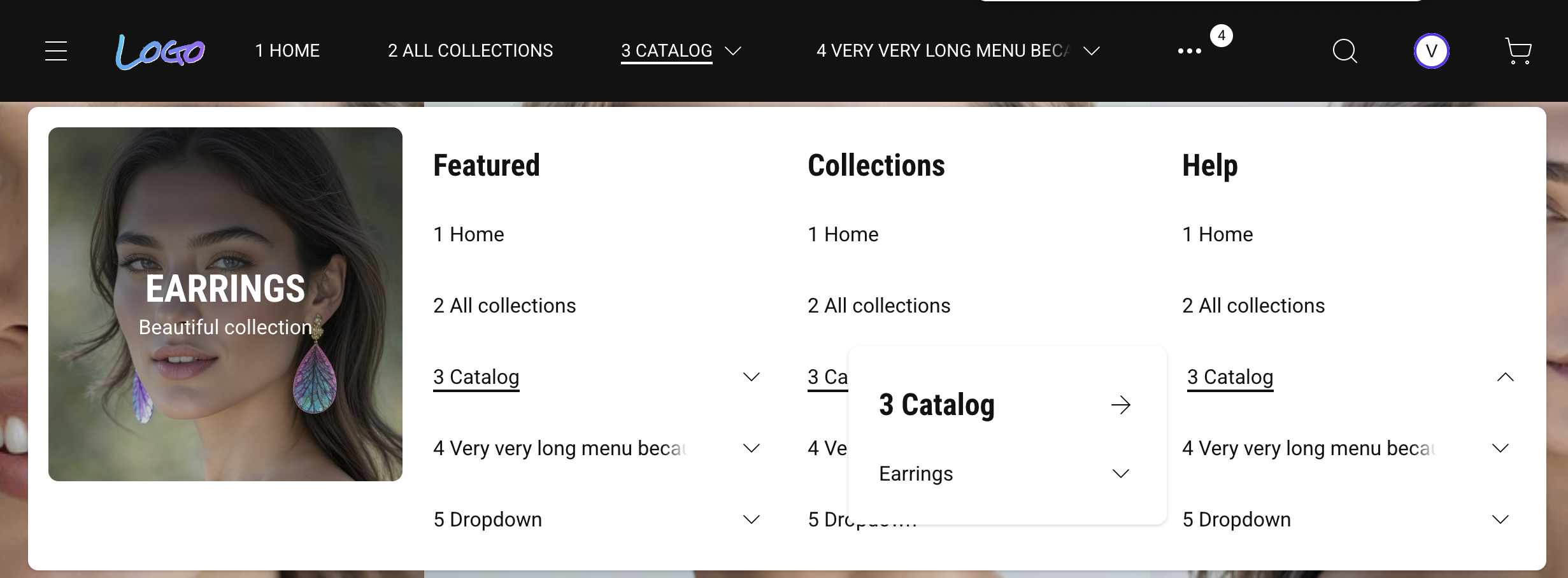
That is merchandising depth without bolting on another app.
If your theme only supports flat lists, you’ll pay for workarounds forever.
Progressive enhancement (plain English)
Under the hood I keep JavaScript lean.
The storefront should stay usable when scripts fail or load late.
For merchants that translates to fewer “white screen header” moments.
For shoppers it means core navigation still works while analytics and chat widgets fight for bandwidth.
That philosophy pairs naturally with RTL markets where mobile networks and older devices still drive real revenue.
Where weTheON fits (honest frame)
The first product line is still in active development.
Submission to Shopify Theme Store is planned toward late 2026.
Until then, the ideas here apply to any theme you evaluate — ask whether it exposes real modular slots or just a long settings panel in disguise.
If you sell cross-border—or plan to—I’m optimizing for:
- modular header composition you control in the editor
- native RTL behavior tied to language direction
- CSS-first rendering so the chrome stays fast and resilient
If that matches your roadmap, follow along here.
We’ll dig deeper into accessibility and Core Web Vitals next—not because merchants love acronyms, but because trust loads before the hero image does.