Shopify Accessibility: How Color Schemes Affect Readability (and Sales)
Color contrast is the #1 accessibility failure on Shopify stores. Learn how to set up color schemes in Theme Editor to pass WCAG AA and keep customers reading.

Most merchants never think about color contrast until someone complains they can't read the site. By then, you've already lost those customers — they don't email you, they just leave.
Color is the fastest and most impactful accessibility fix available in Shopify's Theme Editor. No code. No apps. Just knowing what to look for.
What Are Shopify Color Schemes?
Shopify's Theme Editor lets you define named color palettes — called color schemes — and apply them to sections across your store. Instead of setting colors on every single section individually, you set up 4–6 schemes once, then assign them where needed.
Each scheme controls:
- Background color of the section
- Text color (headings, body copy)
- Button color and button text color
- Link color
- Border and divider colors
Change a scheme once — every section using it updates automatically.
This system is part of Online Store 2.0, and it's where most accessibility problems either get fixed or get baked in at scale.
Why Color Contrast Is an Accessibility Problem
When a customer visits your store, they see text against a background. If the difference between those two colors is too small, the text is hard to read. Some people struggle more than others: people with low vision, color blindness, or anyone reading on a phone in bright sunlight.
"Hard to read" doesn't mean "impossible." It means they slow down, squint, give up, and close the tab.
The industry standard that measures this is called WCAG — Web Content Accessibility Guidelines. It's the same standard behind the European Accessibility Act (enforceable since June 2025 for EU-facing stores) and ADA compliance in the US.
WCAG defines a number called the contrast ratio. You don't need to calculate it by hand — there are free tools for that. What you need to know is:
- Normal text (product descriptions, prices, labels) needs a ratio of at least 4.5:1
- Large text (big headings, hero titles) needs at least 3:1
- Buttons and icons need at least 3:1
These are the WCAG AA minimums. AA is the level the law requires. AAA (stricter) is a bonus, not a baseline.
The Most Common Color Mistakes on Shopify Stores
You don't need to audit every pixel. These five patterns cover 90% of contrast problems in the wild.
1. Gray text on white background.
The classic "clean and minimal" look. Light gray text (#888, #999) on white fails WCAG for body copy every time. It's fine for a giant header, but the moment it's used for product descriptions or prices — customers struggle to read it.
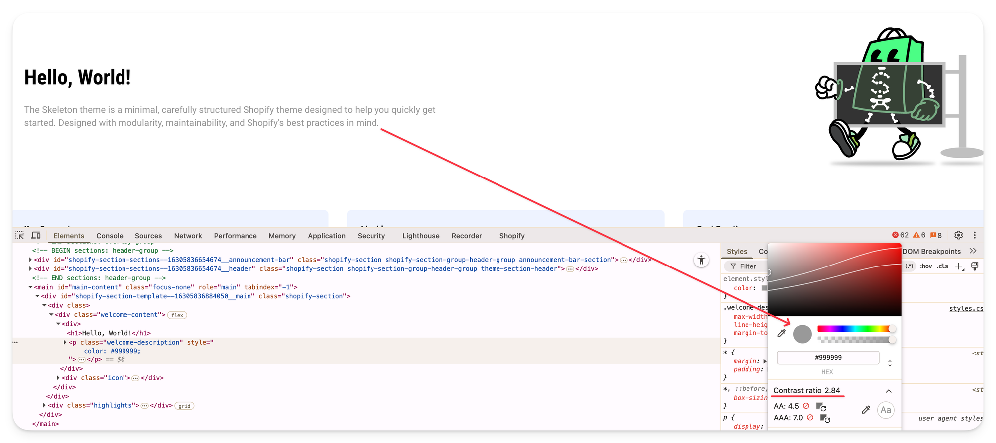
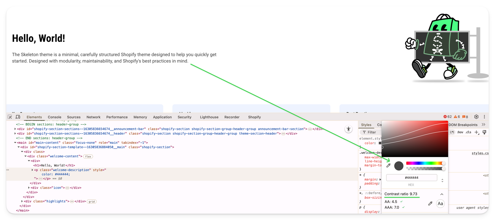
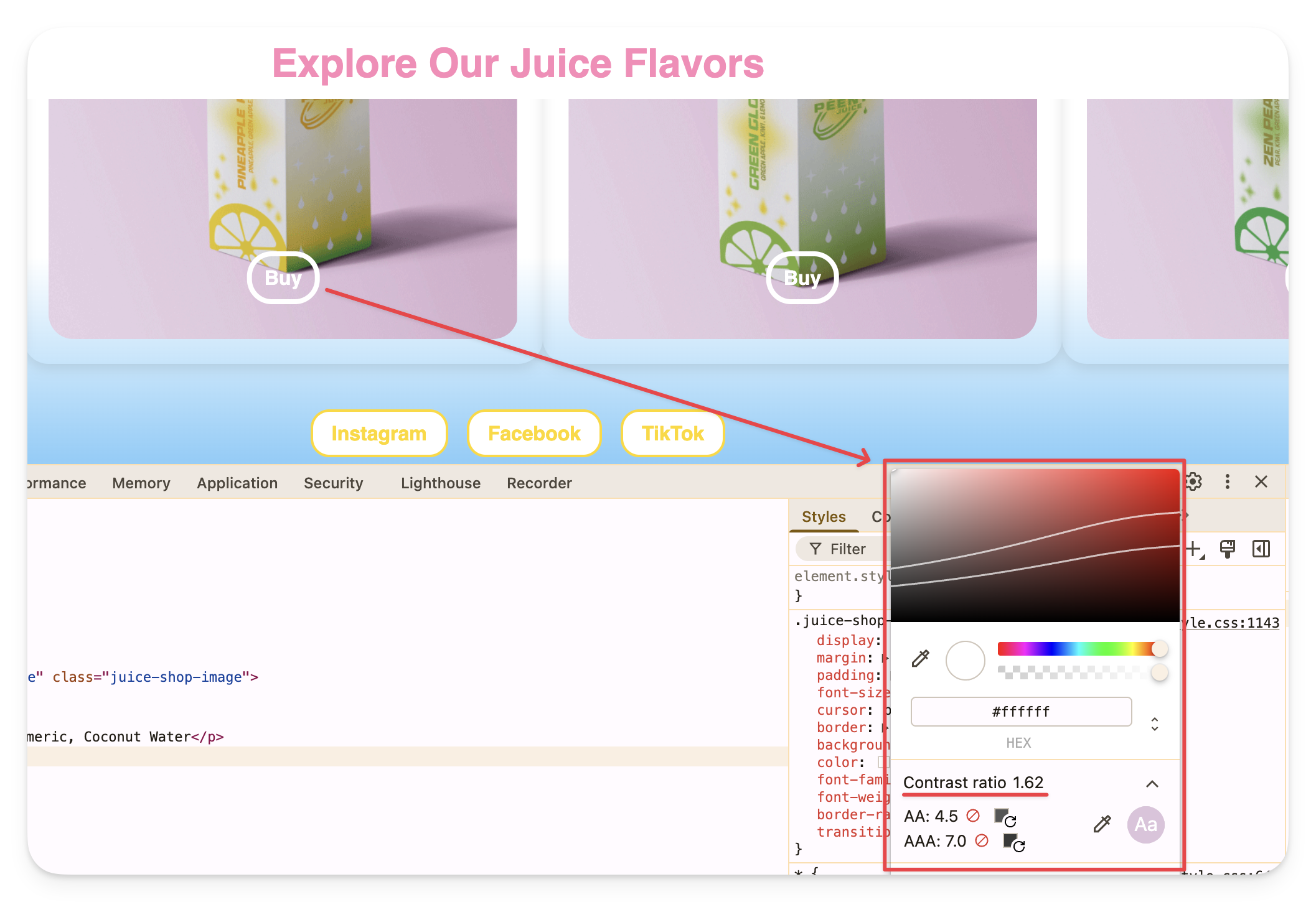
Click to zoom in — good vs. bad contrast ratio in Chrome DevTools
2. White text on a light brand color.
Your brand color is blush pink or sage green. You put white text on it for buttons or banners. It looks beautiful in the mockup. On a phone in sunlight, it's invisible. Check every brand-colored button.
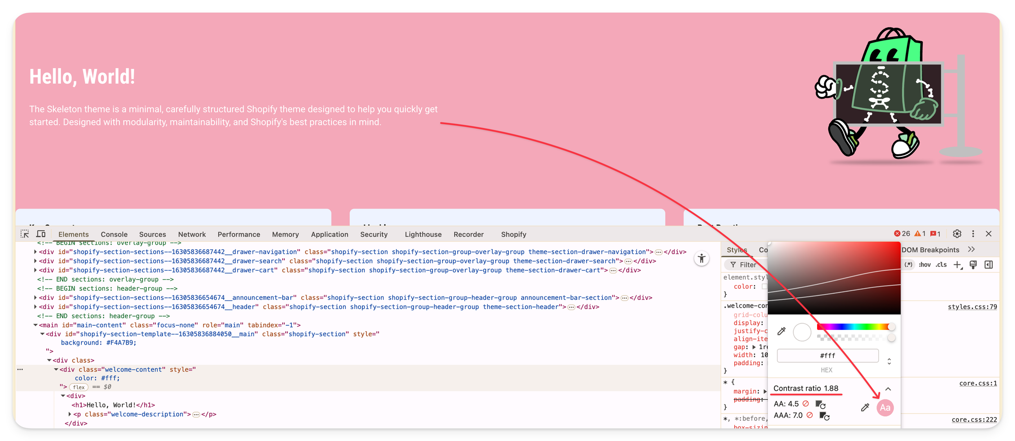
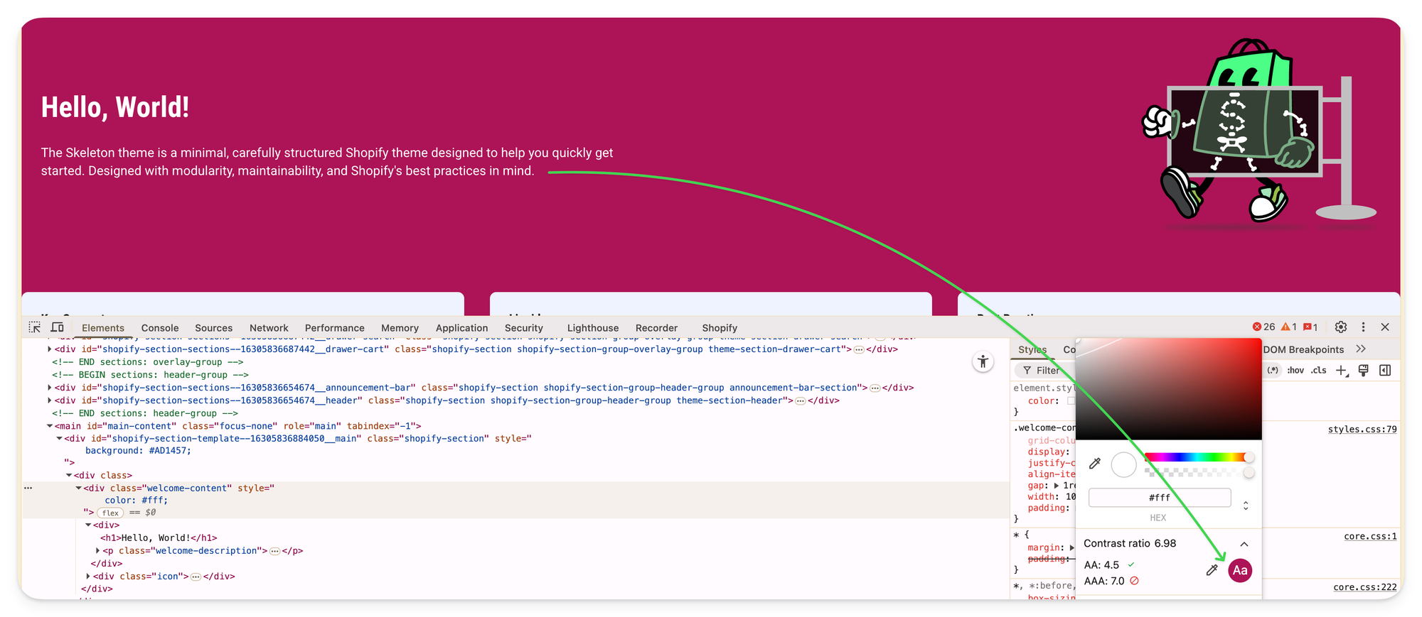
Click to zoom in — white text on blush pink (fails) vs. dark brand color (passes WCAG AA)
3. Links that only differ by color.
If your product links look exactly like regular text — same size, no underline, just a different color — color-blind customers can't tell them apart. WCAG requires a non-color indicator (underline, weight, or other visual cue).
4. Low-contrast placeholder text in forms.
Newsletter signups and search bars often have faded placeholder text like "Enter your email." Many themes set this to 40% opacity by default. That's typically a fail. If customers can't see what the field is for, they don't fill it in.
5. Dark section with inherited light-scheme text.
You add a dark CTA section to your homepage. Looks great. But the theme didn't fully switch the text color for that section — it's still pulling the dark text from your light scheme. Dark background, dark text, invisible content. This is a theme architecture problem, not a color choice problem.
It's one of the most common theme architecture bugs.
How to Check Your Store's Color Contrast (Free, No Code)
Option 1: WebAIM Contrast Checker
Go to webaim.org/resources/contrastchecker. Enter any two colors as hex codes. It tells you the ratio and whether it passes or fails for normal text, large text, and UI elements. Takes 30 seconds.
Option 2: Chrome DevTools
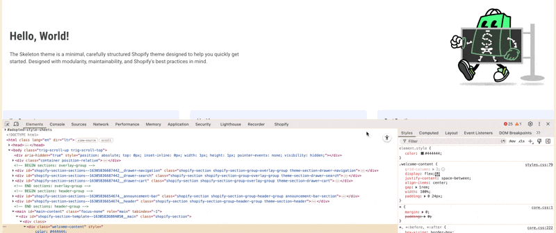
Right-click any text on your live storefront, click "Inspect." In the Styles panel on the right, hover over the color value next to color. Chrome shows a tooltip with the contrast ratio and a pass/fail label. No tools to install.
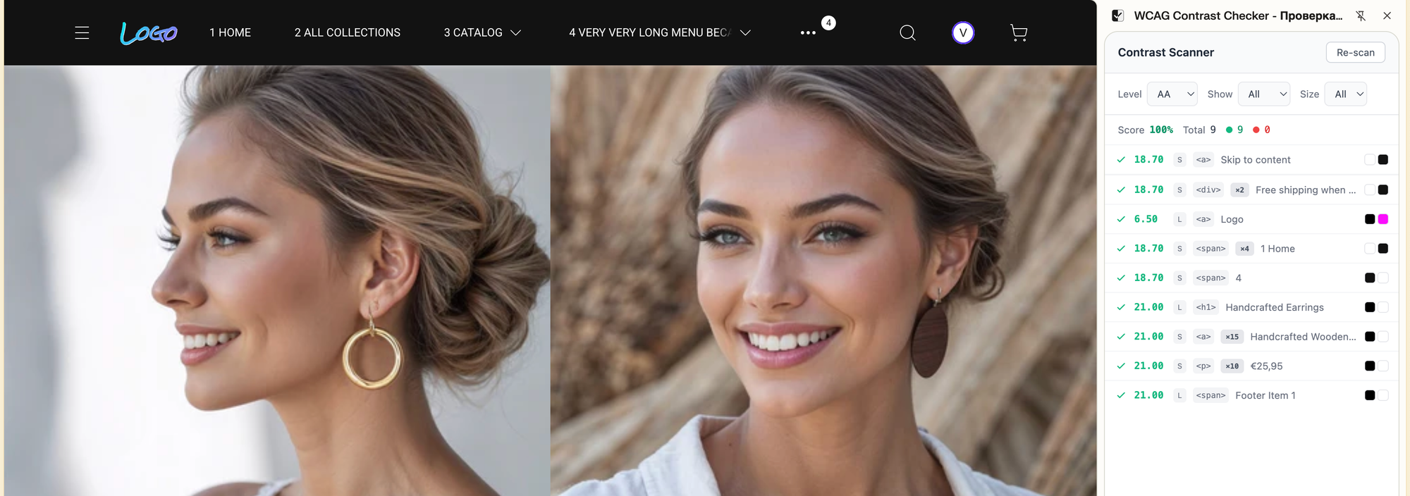
Option 3: WCAG Contrast Checker Extension
Install the WCAG Contrast Checker extension (available in Chrome Web Store).
Open your live store and click the extension icon. It scans every text element
on the page and shows a contrast ratio list — without touching your styles or
layout. Green checkmarks mean pass, red dots mean fail. You see the score, the
element, and the ratio — all in one panel.
How to Fix Contrast Issues in Theme Editor (Without Touching Code)
Once you've found a problem, fixing it takes two steps.
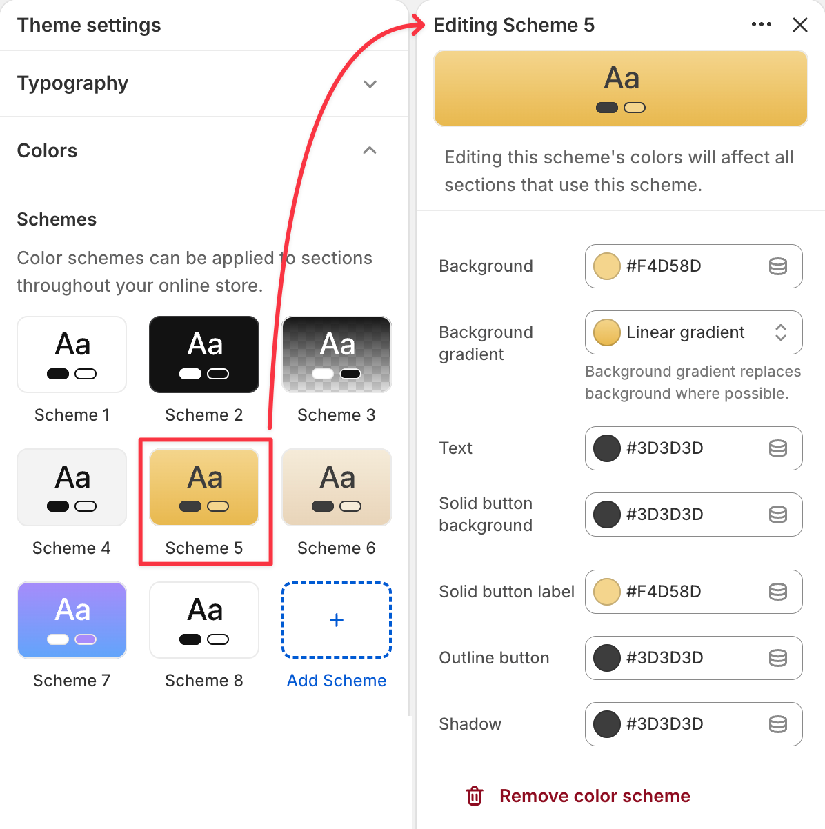
Step 1: Find which color scheme controls that section.
Click the section in the Theme Editor preview. In the left panel, look for the "Color scheme" setting at the top of that section's options. Note which scheme is assigned (e.g., "Scheme 2").
Step 2: Adjust the scheme's colors.
Go to Theme Settings → Colors → find that scheme. Change the text color to something darker, or the background to something lighter, until the contrast checker gives you a pass.
One change here updates every section that uses this scheme across your entire store.
A Safe Starting Point for Your Color Schemes
If you're setting up schemes from scratch, here's a structure that avoids the most common failures.
Scheme 1 — Default (light)
- Background: warm white or very light neutral (avoid pure
#fffif you want soft aesthetics — try#f9f7f5) - Text: near-black (
#1a1a1aor#222) - Result: contrast ratio around 16–18:1. Safe for everything.
Scheme 2 — Brand accent
- Background: your brand color
- Text: Light brand colors need dark text. Dark brand colors need light text. Don't assume.
- Use WCAG Contrast Checker extension to confirm the ratio is at least 4.5:1 for body-sized text.
Scheme 3 — Dark / Inverted
- Background: dark charcoal or near-black (
#111,#1c1c1c) - Text: near-white (
#f5f5f5) - Result: 15–18:1. Dark schemes are actually easier to get right than light ones.
Scheme 4 — Subtle / Secondary
- Background: a muted gray or tinted neutral
- Text: same dark as Scheme 1
- Gotcha: a "subtle" gray can be lighter than you think. Always check.
Why This Matters for Sales, Not Just Compliance
Accessibility and conversion aren't separate problems.
71% of users with disabilities leave sites that are difficult to use without contacting the business first — they just go to a competitor. And color contrast problems don't only affect users with visual impairments. They affect everyone reading in bright light, on a budget phone with an average display, or simply in a hurry.
From a legal angle: the European Accessibility Act has been enforceable since June 2025 — and audits are already happening. Contrast ratio failures are among the easiest issues to detect automatically — they're the first thing any accessibility audit finds. Fines reach €100,000. This isn't hypothetical anymore.
Getting color contrast right in your Theme Editor is the single highest-leverage accessibility fix available to you without touching a line of code.
What I'm Doing Differently in weTheON
When I build a theme, color schemes aren't a setting I add at the end. They're the foundation every section is built on.
Two things I'm paying attention to that most themes skip:
Pre-checked scheme presets. Every color palette that ships with the theme will have verified contrast ratios baked in — for text, buttons, links, form labels. The starting point is accessible by default. Merchants who customize can do so knowing the baseline is solid.
Full scheme isolation between sections. One of the most common theme bugs: a dark section inherits text color from a light scheme, making text invisible. I build against this from the start. Each section's color context is self-contained.
I'm also planning curated palettes for jewelry, beauty, and fashion — aesthetics that work for handmade and luxury brands, and that happen to pass WCAG without looking like an accessibility checklist.
The same applies to RTL stores — I'm designing every color scheme to work correctly in both directions from the start.
weTheON is currently in development.
Join the waitlist — I'll let you know when it's ready.
The Short Version
- Color schemes in Theme Editor control background, text, buttons, and links — across all sections at once.
- WCAG AA requires at least 4.5:1 contrast for normal text, 3:1 for large text and buttons.
- The most common failures: gray text on white, white text on light brand colors, color-only links, faint form placeholders.
- Check with WebAIM Contrast Checker (free, 30 seconds) or Chrome DevTools (built-in).
- Fix by adjusting the scheme's colors in Theme Settings → Colors — one change updates all sections using that scheme.
- If you're selling to EU customers, contrast compliance has been a legal requirement since June 2025.
This is part of a series on Shopify accessibility — covering color contrast, keyboard navigation, touch targets, and more. More coming. Subscribe to get posts first.